
9 Analytics Dashboards That Make Tracking Marketing KPIs Actually Simple
If you’ve ever felt overwhelmed by spreadsheets full of marketing data that don’t tell you anything useful, you’re not alone. The right analytics dashboard can turn a mess of numbers into clear insights that help you make smarter decisions. Whether you’re tracking email campaigns, social media engagement, or conversion rates, these tools bring your most important metrics into one place where you can actually understand what’s working. This list covers nine dashboards that range from freelance marketplaces with built-in analytics to specialized platforms for specific marketing channels, all designed to help you keep tabs on the numbers that matter most.
- Legiit
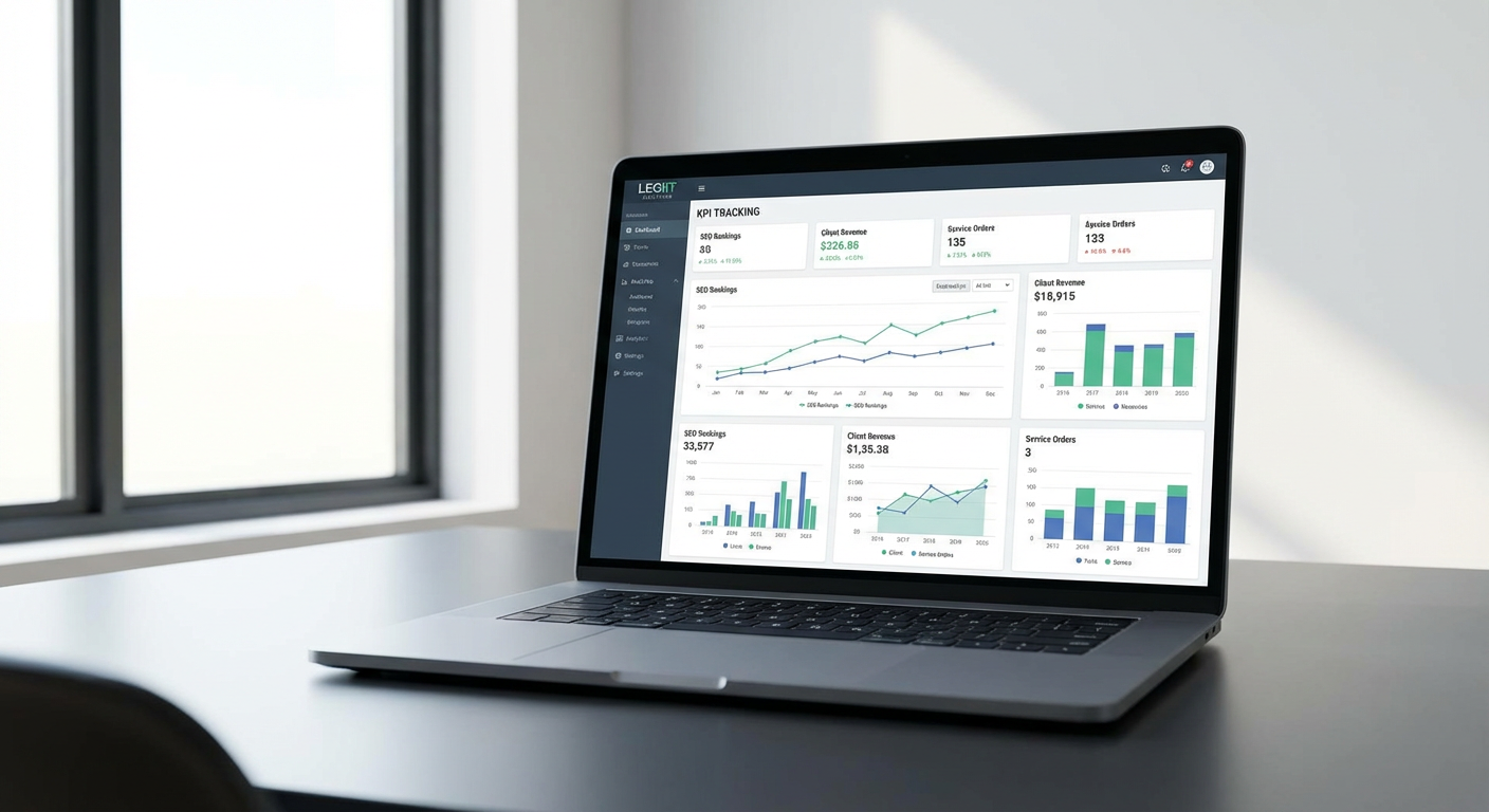
Legiit offers more than just a marketplace for marketing services. It includes analytics features that help you track the performance of campaigns you’re running through the platform. If you’re outsourcing SEO work, content creation, or social media management through Legiit, you can monitor progress and results directly within your dashboard. This means you don’t have to jump between multiple tools to see how your hired services are affecting your marketing KPIs.
The platform gives you visibility into project timelines, deliverables, and outcomes, which is particularly helpful if you’re managing several freelancers at once. You can see which services are driving the best results and make informed decisions about where to allocate your marketing budget. For small business owners and marketers who rely on external help, having this kind of transparency built into the service marketplace saves time and reduces confusion.
- Klipfolio
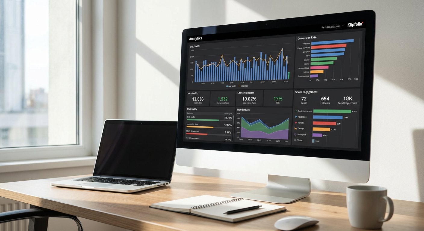
Klipfolio takes a different approach by letting you build custom dashboards from scratch. Instead of forcing you into a template, it connects to hundreds of data sources and lets you pull exactly the metrics you care about. This flexibility makes it a strong choice if your marketing stack includes tools that don’t always play nicely together.
You can create visualizations that combine data from your CRM, advertising platforms, email software, and website analytics all in one view. The learning curve is steeper than some plug-and-play options, but the payoff is a dashboard that matches your specific needs. If you need to track niche KPIs or industry-specific metrics, Klipfolio gives you the building blocks to make it happen without compromising on what you actually want to measure.
- Cyfe
Cyfe positions itself as an all-in-one dashboard that’s particularly friendly for teams that don’t have a dedicated data analyst. The interface is straightforward, and you can get a functional dashboard running in less than an hour. It pulls data from popular marketing tools like Google Analytics, Facebook Ads, Mailchimp, and dozens of others through pre-built integrations.
What makes Cyfe practical is its focus on simplicity without sacrificing depth. You can track website traffic, social media metrics, sales data, and email performance side by side. The tool also includes white-label options if you need to share reports with clients, and the pricing is reasonable for small to mid-sized marketing teams. It won’t win awards for the most advanced features, but it handles the fundamentals well and keeps your KPIs visible without making you work too hard for them.
- Geckoboard
Geckoboard is built for teams that want their dashboards displayed on office screens or monitors where everyone can see them. The tool emphasizes real-time data and clean, readable visualizations that make sense from across the room. This makes it particularly useful if you want your marketing metrics to stay top of mind for the whole team.
The setup process focuses on choosing which KPIs matter most and presenting them in a way that’s easy to scan quickly. You can connect it to your marketing platforms, sales tools, and support software to get a holistic view of how your efforts are affecting the business. Geckoboard works best when you have a clear idea of which three to five metrics you want to monitor constantly. It’s less about deep-dive analysis and more about keeping your most important numbers front and center where they won’t be ignored.
- Improvado
Improvado targets mid-sized to large marketing teams that juggle dozens of data sources and need serious automation. This platform specializes in marketing data aggregation, pulling information from advertising platforms, analytics tools, CRMs, and more into a centralized warehouse. From there, you can push the data to your preferred visualization tool or use Improvado’s built-in reporting.
The strength here is in handling complex data pipelines without requiring you to write code or manually export CSV files every week. If you’re running campaigns across Google Ads, Facebook, LinkedIn, TikTok, and other channels simultaneously, Improvado automates the collection and normalization of all that data. It’s a bigger investment than simpler dashboard tools, but for teams drowning in data from multiple sources, the time savings and accuracy improvements make it worthwhile. You’ll need a clear plan for how you want to use the data, but Improvado handles the heavy lifting of getting it all in one place.
- Mixpanel
Mixpanel focuses specifically on product and user behavior analytics, which makes it valuable for marketers who care about what happens after someone clicks your ad or visits your site. Rather than just showing you pageviews and bounce rates, Mixpanel tracks how users interact with your product or website over time. You can see which features they use, where they drop off, and what paths lead to conversions.
This level of detail helps you connect marketing efforts to actual user behavior and long-term retention. If you’re running campaigns to drive signups, Mixpanel shows you not just who signed up, but whether they became active users and what their journey looked like. The dashboard includes funnel analysis, cohort tracking, and retention reports that go beyond surface-level metrics. For marketers working on SaaS products, apps, or subscription services, Mixpanel fills in the gaps that traditional web analytics leave behind.
- Databox
Databox strikes a balance between ease of use and customization, making it accessible for small teams while still offering enough power for more complex needs. The platform includes templates for common marketing scenarios, so you can start with a pre-built dashboard and modify it as you go. It connects to most major marketing tools and displays your KPIs through clean visualizations that update automatically.
One feature that stands out is the mobile app, which gives you access to your dashboards when you’re away from your desk. You can check campaign performance, website traffic, and conversion metrics from your phone without logging into a desktop browser. Databox also includes goal tracking and alerts, so you get notified when metrics hit certain thresholds. This combination of accessibility and functionality makes it a practical choice for marketers who need reliable reporting without a steep learning curve or a massive budget.
- Supermetrics
Supermetrics takes a different approach by acting as a data connector rather than a standalone dashboard. It pulls marketing data from platforms like Google Ads, Facebook, Instagram, LinkedIn, and many others, then sends that data to tools you already use like Google Sheets, Excel, Google Data Studio, or Tableau. This means you build your dashboards in familiar environments while Supermetrics handles the data collection.
The advantage is flexibility. If your team already works in Google Sheets for reporting, Supermetrics keeps that workflow intact while automating the data updates. You don’t have to learn a new interface or convince everyone to switch tools. The downside is that you’re responsible for setting up the actual dashboard and visualizations, but for teams that prefer control over their reporting format, this approach works well. Supermetrics is particularly strong if you’re managing paid advertising across multiple platforms and need to consolidate spend and performance data regularly.
- Plausible Analytics
Plausible Analytics offers a refreshingly simple alternative to complex analytics platforms, focusing specifically on website metrics that actually matter. The dashboard fits on a single screen and shows you visitors, pageviews, bounce rate, visit duration, and traffic sources without overwhelming you with dozens of metrics you’ll never use. It’s also privacy-focused, which means it doesn’t use cookies and complies with privacy regulations without requiring cookie banners.
For content marketers and small business owners who just need to know if their website traffic is growing and where visitors are coming from, Plausible removes the noise. The interface loads quickly, the data is easy to understand, and you can share reports with teammates or clients through simple links. It won’t replace a full analytics suite if you need detailed conversion tracking or e-commerce analytics, but for monitoring core website KPIs without the bloat, Plausible gets the job done efficiently.
Choosing the right analytics dashboard comes down to matching the tool to your specific needs and workflow. Some platforms excel at pulling together data from multiple sources, while others focus on simplicity and ease of use. Consider which marketing channels you’re most active on, what KPIs you check most often, and whether you need something your whole team can use or a more specialized tool for deep analysis. The best dashboard is the one you’ll actually check regularly and that gives you actionable information, not just more data to sift through. Start with the metrics that directly affect your business goals, and pick a tool that makes tracking those numbers as straightforward as possible.